System on: A Display Font That Means Business
First Glance: Sharp, Structured, Slightly Unsettling—In the Best Way
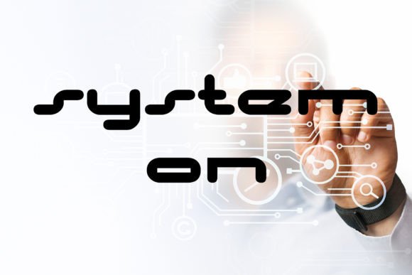
Opening System on for the first time, I didn’t feel inspired—I felt *alert*. It’s not playful. It’s not nostalgic. It’s a display font that carries weight without shouting, precision without sterility. The letterforms are tightly constructed—geometric but not rigid, with subtle tapering in strokes and a quiet asymmetry in terminals that keeps it from feeling like a machine output. There’s a controlled tension in the contrast between thick verticals and thin horizontals, and the spacing feels intentional, almost architectural. System on doesn’t invite you in—it invites you to *pay attention*. That makes it ideal for brands building authority, innovation, or understated luxury—not whimsy or warmth.
Where It Actually Works (and Where It Doesn’t)
System on shines where clarity meets impact: logo design for tech-adjacent startups, brand identity systems needing a strong anchor typeface, premium packaging for skincare or audio gear, product labels demanding instant legibility at arm’s length, and editorial design for high-end magazines covering architecture or design criticism. I’ve used it successfully in website headers where the brand voice is concise and confident—no fluff, no filler—and in social media graphics where one bold word (“Clarity”, “Signal”, “Shift”) needs to land in under two seconds.
It also holds up beautifully in physical contexts: screen-printed merchandise, foil-stamped business cards, die-cut product tags, and Canva templates built for service-based creators who want polish without pretension. For Cricut projects? Yes—but only for medium-to-large vinyl cuts. Its tight spacing and fine details don’t translate cleanly below 24pt on cut files unless you manually adjust tracking.
What doesn’t work? Body copy. Never. System on is a display font, full stop—not a workhorse sans serif font. Don’t try it in blog paragraphs, email newsletters, or app interfaces. It’s also overkill for casual invitations, handwritten-style branding, or anything requiring approachability or softness. Pairing it with a script font or handwritten font feels jarring unless deliberately contrasted for irony or conceptual intent (e.g., a fintech brand using System on for headlines beside a warm, humanist sans serif for body text).
Real-World Performance Notes
- Readability: Excellent at 36pt and above—sharp, unambiguous, even at distance. But test small sizes rigorously: below 18pt, some characters (like lowercase ‘a’, ‘e’, and ‘s’) begin to blur visually, especially on low-res screens or printed materials with absorbent stock.
- Hierarchy & Trust: When used as a primary display font, System on instantly elevates perceived professionalism. Clients notice it—even if they can’t name why. It signals that decisions were made deliberately, not defaulted. That builds trust faster than any tagline.
- Recognition & Consistency: Its distinct rhythm and spacing make it highly scannable and memorable in logos and social posts. But consistency hinges on strict usage rules: define exact weights (Light, Bold, or Black only—avoid Regular), cap height alignment, and always pair with a neutral, highly legible sans serif font for supporting text.
- Visual Mood & Engagement: It leans cool, calm, and resolved—not urgent, not emotional. That works powerfully for B2B, design-forward retail, or cultural institutions. But it won’t boost engagement for lifestyle blogs or wellness brands chasing warmth. Know your audience’s emotional temperature before committing.
Practical Designer Notes You’ll Thank Me For
Before locking System on into your next project, do these five things:
- Test it in pure black on pure white—no gradients, no overlays. See how the contrast holds up. Then flip it: white on black. Some display fonts collapse in reverse; System on stays crisp, but its fine details soften slightly. Adjust tracking +5–10 units if needed.
- Print a real mockup at actual size—especially for packaging or product labels. Screen rendering lies. What looks balanced on Retina displays may feel cramped on matte-coated paper.
- Compare uppercase vs. lowercase use. System on’s uppercase is commanding and clean. Lowercase is more nuanced—but less distinctive. For logos and brand marks, uppercase delivers stronger recognition. For quotes or short phrases in editorial design, lowercase adds quiet sophistication—if line spacing is generous.
- Review spacing *between* letters, not just within them. Kerning pairs like “AV”, “To”, and “We” need manual attention in headlines. The default metrics are solid, but not perfect for every context.
- Test font pairing *in context*, not isolation. Try System on beside a sturdy serif font (e.g., Tiempos Text) for editorial gravitas, a neutral sans serif font (e.g., Inter or Neue Haas Grotesk) for digital balance, and a restrained script font (not decorative—think a single-word signature treatment) for contrast. Avoid pairing with other display fonts unless you’re building deliberate typographic tension.
Licensing, Legibility, and Long-Term Use
System on is a commercial font—make sure your license covers the intended use: client work, digital products, printable design, or resale assets like Canva templates or Cricut bundles. Some licenses restrict web embedding or SaaS platforms. Confirm before delivery.
Also remember: a premium font isn’t automatically the right font. System on earns its place when the project demands structure, restraint, and visual intelligence—not when it just “looks expensive.” It supports modern typography by refusing trendiness. It doesn’t chase attention—it commands it through discipline.
If your brand identity hinges on clarity, your packaging needs to feel considered down to the millimeter, or your social media graphics must communicate competence before comprehension—System on is worth the scrutiny. Just don’t treat it like a universal tool. Respect its limits, honor its logic, and let it do what it does best: stand for something precise, unwavering, and quietly authoritative.